
Refreshing your visual identity
Since 2020, state parks have seen massive upticks in visitors. The pandemic forced people to self-reflect and find new ways and places to interact. As a result, the outdoors became a safe haven for many, and state parks became an avenue for those looking to reconnect with nature. Washington State Parks (Parks) was no exception and saw 43,840,590 visitors in 2021, a 14-percent increase from 2019. Encouraged by the record numbers, agency officials saw an important opportunity to re-examine how it presented its mission and values to the public.
Parks’ visual identity has remained relatively unchanged since the 1960s, when an employee sketched the original logo for practical purposes—a recognizable shield for uniforms and park entrances. The logo served its purpose and was well-loved by many, but did not represent the growth the agency experienced over the years, nor did it celebrate the 120,000 acres of diverse natural landscapes across the state.
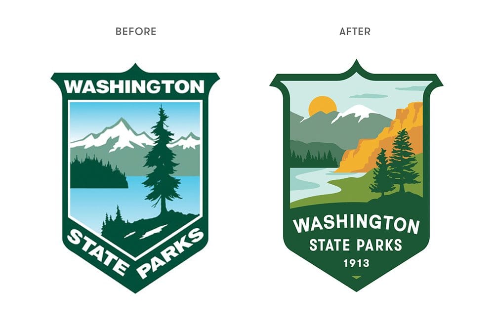
Parks officials wanted to emphasize the reconnection with nature and outdoor recreation spurred by the record number of visitors during the pandemic. There was a desire for the logo to strengthen the belief that the outdoors should be welcoming and accessible to all—from seasoned nature enthusiasts to first-time adventurers—and represent the range of memories and emotions tied to these remarkable places. Parks leaders needed a North Star, a point to focus on and work toward, to ensure people from all around the state, of all ability levels, would feel welcome and wanted in the outdoors.